Common business card design mistakes
Make a great first impression and ensure customers hold on to your card by avoiding these common missteps.
Get started
4 mistakes to avoid when designing your business card
A well-designed business card does a lot more than share your contact information. It makes you look professional and helps to build trust with potential customers. However, business cards have limited space, leaving room for mistakes.
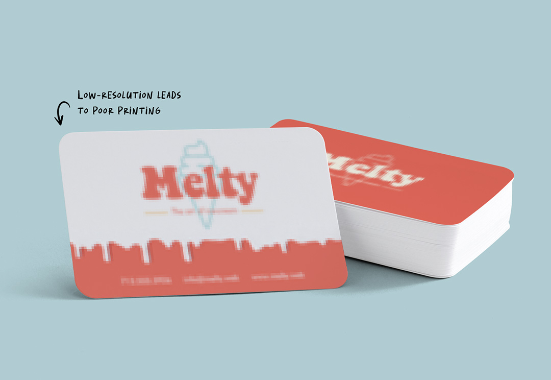
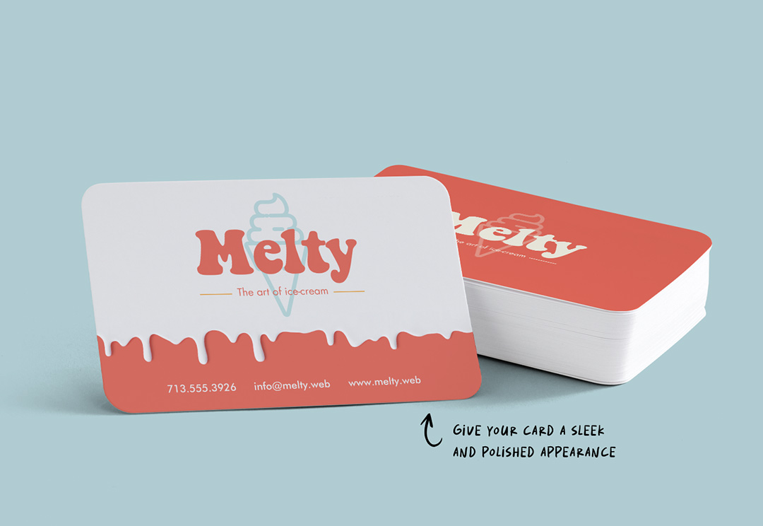
Using low-resolution artwork
One of the most common mistakes made by those who are not professional designers is adding low-quality images. It’s an easy error to make as logos, social media icons, or headshots can appear crisp on a computer screen but pixelated once printed. To avoid this mistake, make sure your files are 300 dpi or higher.
Get startedDesign tip: Your logo should be prominently displayed on your business card. Add a high-resolution file to the backside of the card along with your business tagline to create brand awareness.
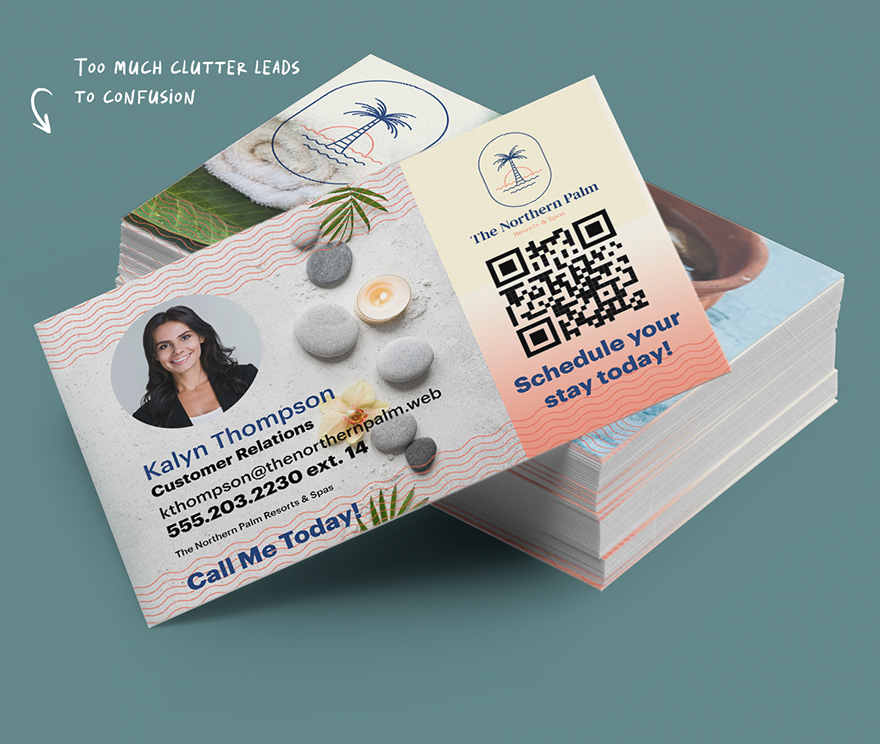
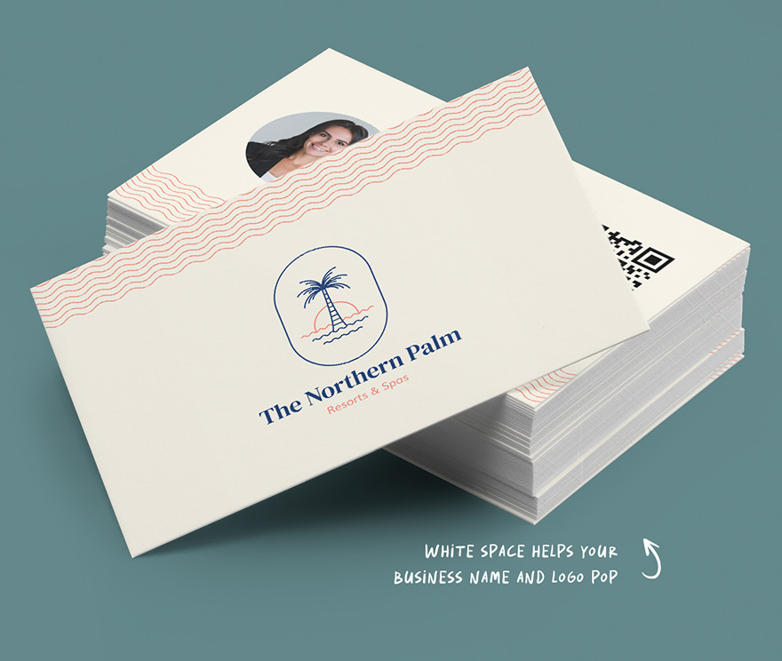
Adding clutter
While you can get creative with your card, don’t overload it with information. Too many design elements will compete for the reader’s attention and distract from the ultimate goal of your business card: to help prospective clients get in touch with you. Instead, keep it simple. Introduce yourself and give a quick way for people to contact you.
Get startedDesign tip: Leaving a little bit of white space on your card not only draws the eye to important details, but also gives you space to jot down a note if needed.
Choosing the wrong font
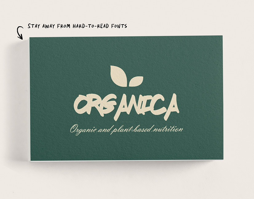
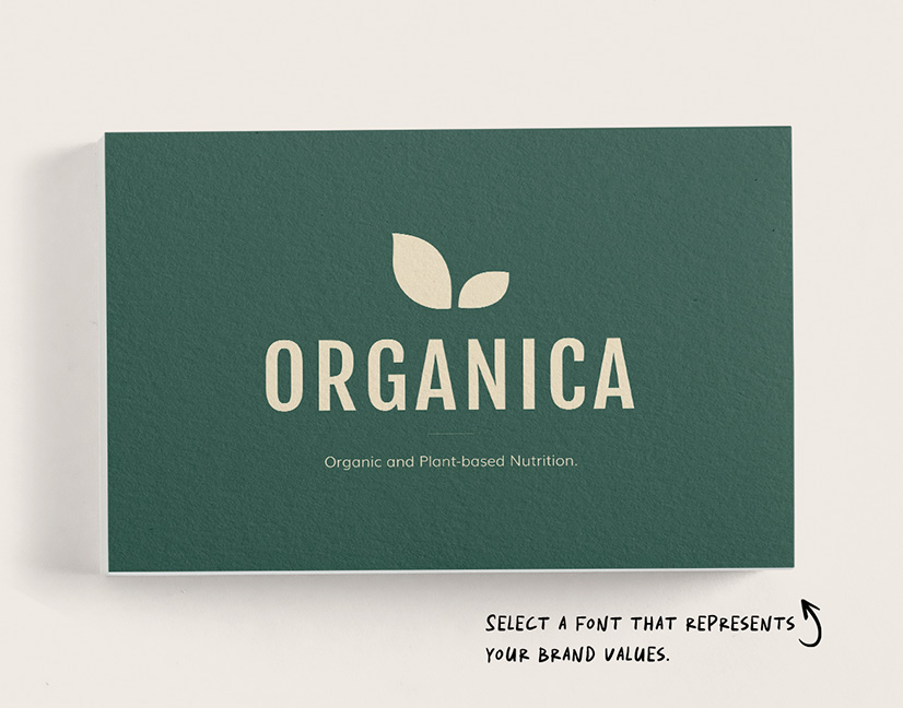
The fonts you choose for your card should follow two rules—they should be easy to read and represent your business. Avoid decorative or script-like fonts as they are hard to read in a small area. Don’t forget to consider your industry when selecting a font. For example, it might raise some eyebrows if a law firm used the playful Comic Sans font on their business cards.
Get startedDesign tip: Try using different weights (bold, regular, italic) of the same font to create contrast and visual interest. Your text should be at least 8 pt. size, while more important information can be larger or bold.

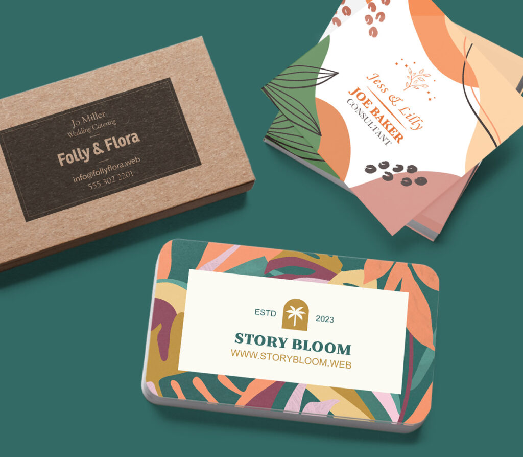
Printing on thin paper
Since your business card reflects your brand and the products or services you offer, don’t skimp out when choosing a paper stock. Printing on flimsy paper can leave the impression that your products are poor quality. A thin card can also tear or bend in your customers’ wallets before they have the chance to contact you.
Get startedDesign tip: From linen to Kraft paper, there are many different paper stocks and materials that feel sturdy. Elevate your card further with unique finishes such as metallic or gloss.
ProShop is an online print portal that makes it easy for your company to customize and order business cards. You can create design templates that lock in certain elements while allowing other fields to be editable. Your team members can easily update their information without making changes to the card design.
If you need help modifying your business card or designing a new one from scratch, our design services team is here to assist you. We can create business cards that represent your brand and make an impact from your first interaction with a customer.
Get started today!
Get started by filling out the form or giving us a call at 844-347-4162 and see how we can help your company. A sales representative will get back to you via phone within 24 hours of receiving your request.
